One thing to improve marketing?
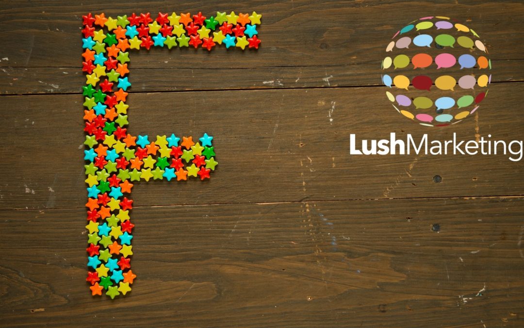
Wouldn’t we all love to know that ONE thing that will improve our marketing?! However, for some the answer is quite simple. Remember that your customer or potential customer, consumes content visually in an “F” shape.
“F” shape?
The F–shaped scanning pattern means that users (aka people!) may skip important content simply because it appears on the right side of the page. Users will read the top horizontal line first. This is the top of the “F”. They will then scan down vertically. This is the stem of the “F”. They may then revert to the second horizontal or view this before the vertical. But either way, they will view the second horizontal line of the “F” shape. It is kind of like heat mapping to track the eye and where it sees.
Social media
You’ll see from the example of the letter here, that it is best not to place important content in the bottom right quadrant. Think of your social media posts. Where are you currently placing your logo? How do you place any call to actions (e.g. read more, click here, buy now, etc.)? Where is the eye drawn to in your current posts? Perhaps there is too much content in the post and this is distracting from the main message.
For all social media platforms this “F” is important. However, I think the one that it is most prominent is on Instagram. I’ve seen businesses placing logos, lovely images and big call to action pieces in the wrong place. Take a look the next time and see how other brands do it.
Websites
I’m always fascinated by the likes of heat mapping on websites. There are apps that can be used to see where the user goes to click and tools to detect where the eye is drawn. If you happen to come across these you will see the heat or red colour shining through mostly in an “F” shape or sometimes a “Z” shape. The Zig-Zag approach is quite common on websites, as apparently this is the way the eye digests content on websites.
When do you need to remember the “F”?
Take a fresh look at your current marketing material:
- If you have a website where is the most important content placed? If you see that it’s sitting in the wrong section or area, then get it changed.
- What does your Instagram feed look like? Is there branding on it?
- Do you have printed materials? Again, where is the prominent content placed?
- Presentations are similar. If you are trying to impress your boss or future client, check to see where the content is sitting.
Summary
In conclusion, users will read the top horizontal line first. This is the top of the “F”. They will then scan down vertically. This is the stem of the “F”. They may then revert to the second horizontal or view this before the vertical. But either way, they will view the second horizontal line of the “F” shape.
If the user, viewer, customer, follower, or whatever you wish to call them, views in the shape of the “F”, then please remember to create content with that in mind. Keep the most important information placed here and avoid placing important information in the bottom right hand side, in particular.
This is something that I learned a couple of decades ago and the theory still stands true today, albeit there are a number of iterations of this theory. In practice, remember where your customer is looking and don’t hide your content that you want them to see! Get in touch to let us help with your marketing!


